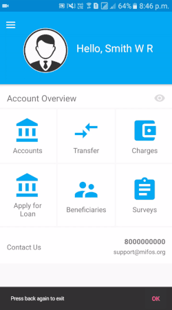
Materializing Android Applications
Material Design focuses to create a beautiful and consistent user experience based on design principles and standards. Here are the guidelines in order to materialise android application and some best practices.
Getting Started
Start with choosing a color palette from https://www.materialpalette.com/. It shows the selected color combination on an android screen and allows to download selected color patterns in xml format.
Adding ripple to a view
Views respond to users touch with a ripple effect. A simple way to add ripple effect you a view is to add '?selectableItemBackground' as foreground of a view.
Example:
<LinearLayout
 android:layout_width="wrap_content"
 android:layout_height="match_parent"
 android:clickable="true"
 android:foreground="?selectableItemBackground">
<!-- Add your views here -->
</LinearLayout>Use AppCompatButton instead of Button
Case 1:
When we use button and change it's background color then it loses it's material properties i.e. elevation and ripple effect.
For eg:
<Button
 android:background="@color/primary"
 android:text="@string/make_transfer"
 android:textAppearance="?android:textAppearanceMedium"
 android:textColor="@android:color/white"/>
which leads to :
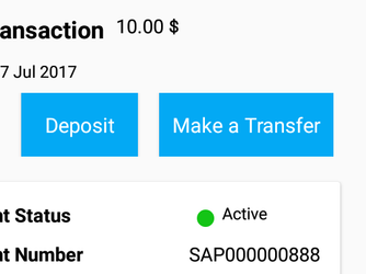
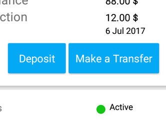
Case 2:
When we use AppCompatButton and change it 'backgroundTint' in order to change it's color
For eg:
<android.support.v7.widget.AppCompatButton
 android:layout_width="wrap_content"
 android:layout_height="wrap_content"
 android:textColor="@color/white"
 app:backgroundTint="@color/primary"/>
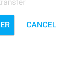
Getting Borderless Material Button
Use Appcompat button in order to get a borderless material button with style @style/Widget.AppCompat.Button.Borderless.
For example:
<android.support.v7.widget.AppCompatButton
 android:layout_width="wrap_content"
 android:layout_height="wrap_content"
 android:textColor="@color/primary"
 style="@style/Widget.AppCompat.Button.Borderless"
 android:text="@string/cancel"/>
which results in:
Adding Parallax effect using CollapsingToolbar
Output:

XML Layout code :
In order to set CollapsingToolbar title and color we need to write some java code:
@BindView(R.id.collapsing_toolbar)
CollapsingToolbarLayout collapsingToolbarLayout;
....
collapsingToolbarLayout.setCollapsedTitleTextColor(ContextCompat.getColor(getActivity(),
        R.color.white));
collapsingToolbarLayout.setExpandedTitleColor(ContextCompat.getColor(getActivity(),
        R.color.white));
....
collapsingToolbarLayout.setTitle("Name");Using SVGs instead of pngs or jpgs
In order to use svg we need to enable vectorDrawables.useSupportLibrary in defaultConfig in app build.gradle file.
defaultConfig {
    ...
 vectorDrawables.useSupportLibrary = true
}
Then import a svg file by Right clicking on drawable > New > Vector Asset . Choose Local file and import your svg file.
After import it use that file in an imageview using 'srcCompat' attribute.
<ImageView
 android:layout_width="100dp"
 android:layout_height="100dp"
 app:srcCompat="@drawable/name_of_vector_file"/>
Using SVGs in a View's drawable or as a MenuItem icon
Using vector images without srcCompat leads to a crash below Android Lollipop for example if we want to use a vector in drawable of a textview or as a menuitem icon then we need to wrap that vector image first in layer-list.
<?xml version="1.0" encoding="utf-8"?>
<layer-list xmlns:android="http://schemas.android.com/apk/res/android">
    <item android:drawable="@drawable/name_of_vector_file"/>
</layer-list>
If this file is saved as 'wrapper_vector_file' then
<TextView
 android:layout_height="wrap_content"
 android:layout_width="wrap_content"
 android:drawableLeft="@drawable/wrapper_vector_file"
 tools:text="@string/medium_text"/>
Using CardViews
CardViews are a common pattern for creating views with distinct piece of information.As CardView extends from Framelayout so we need to add a linearlayout or a relativelayout within the cardview.You can customise cardview using 'cardElevation' for providing a elevation to the card and 'cardCornerRadius' in order to make rounded corners.
<android.support.v7.widget.CardView
 android:layout_width="match_parent"
 android:layout_height="wrap_content"
 android:clickable="true"
 android:foreground="?selectableItemBackground"
 app:cardElevation="@dimen/cardview_default_elevation">
    <LinearLayout
  android:layout_width="match_parent"
 android:layout_height="wrap_content">
<!-- Add your views here→
    </LinearLayout>
</android.support.v7.widget.CardView>
Material Icons
You can get some general material icons from https://material.io/icons/